Visualize
Data visualization is one of the important steps of the process, which states that after data has been collected, processed and modeled, it must be visualized for conclusions to be made.
Katonic provides a component called Visualize to create the dashboards and charts so that you can take important insights of your data and take important business decisions.
Get Started with Visualize
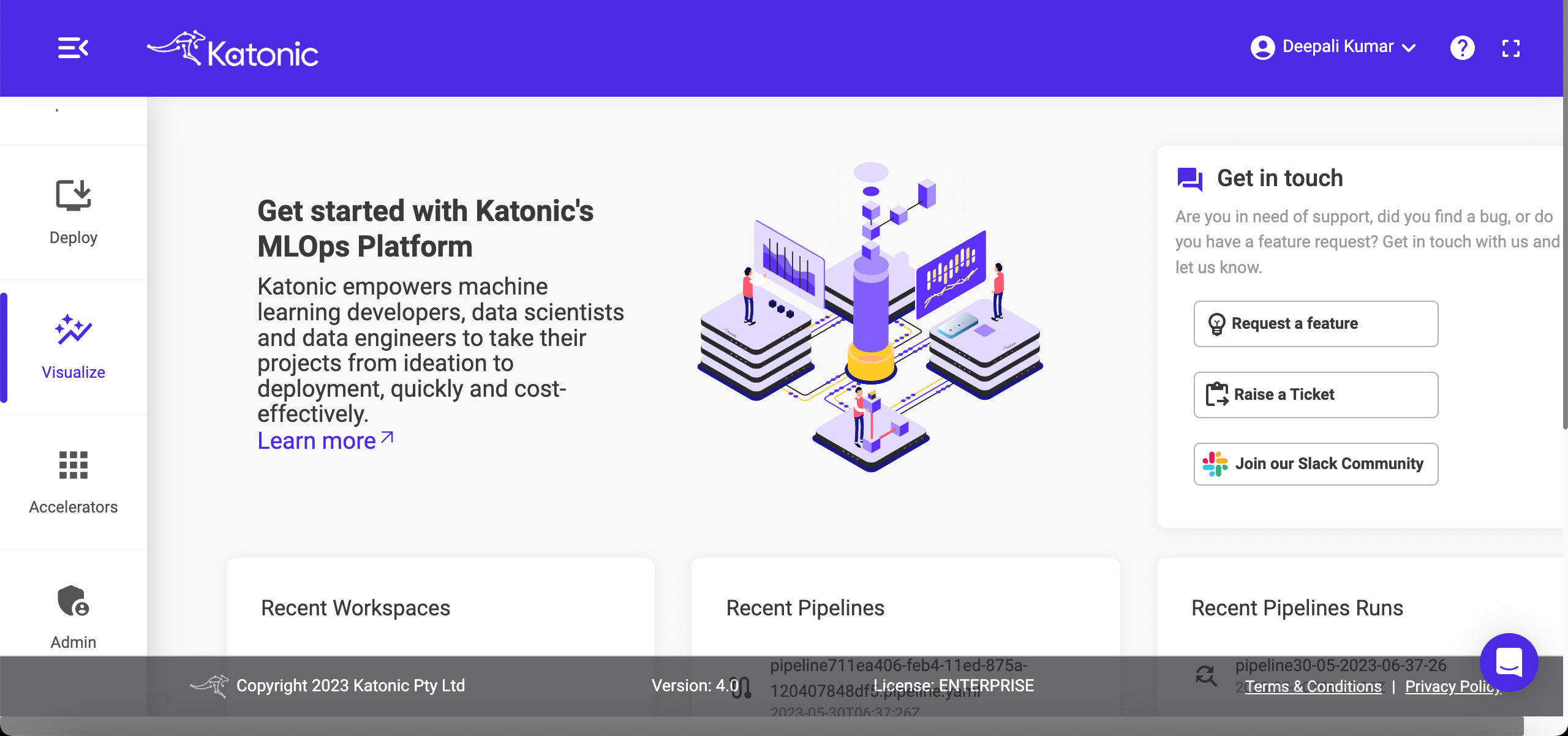
From the platform, navigate to Visualize.
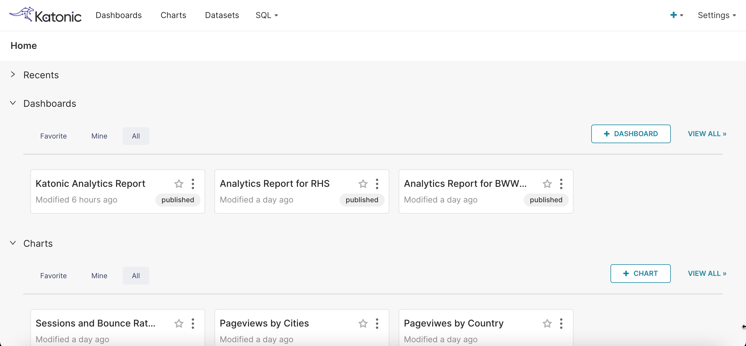
It will take you to a new page, a home screen will open, where you can see all the things together,
Recents: It will show the recently created charts and dashboards.
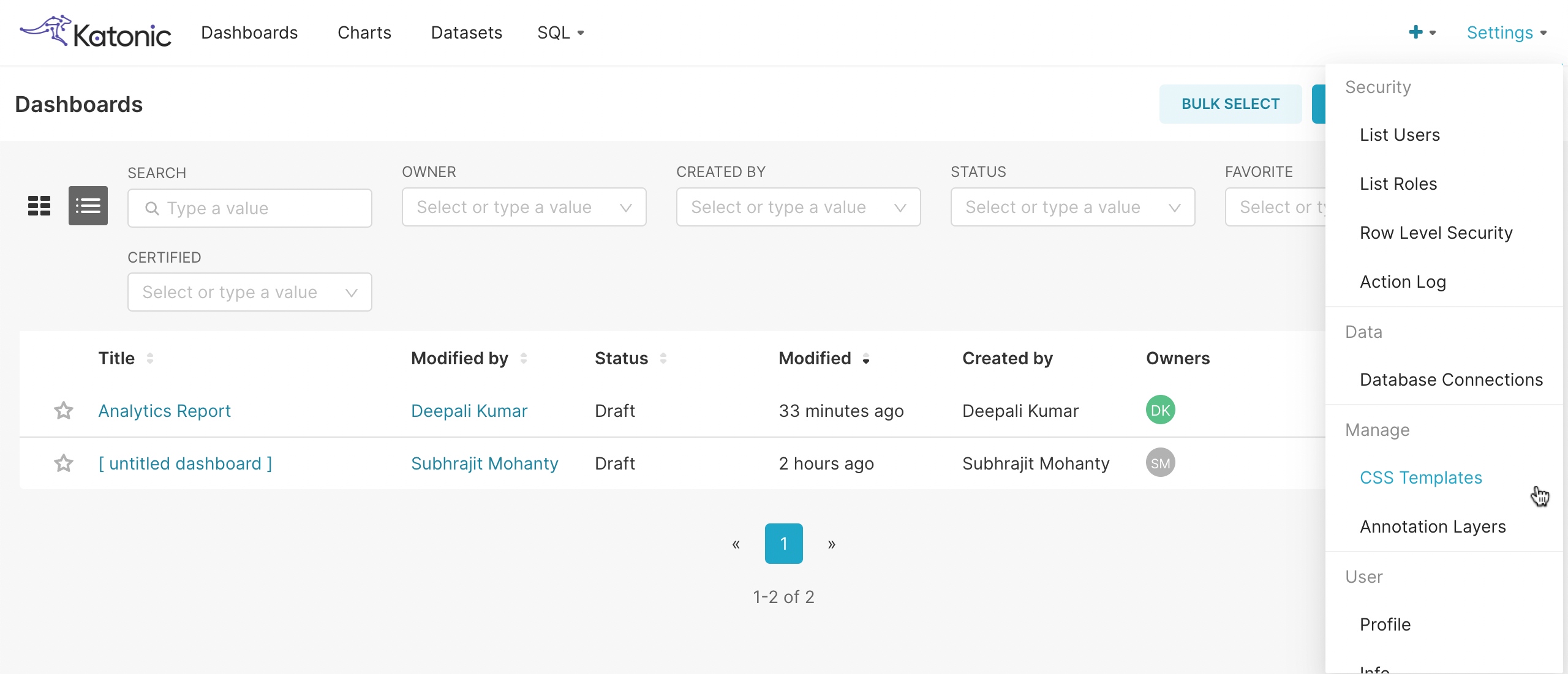
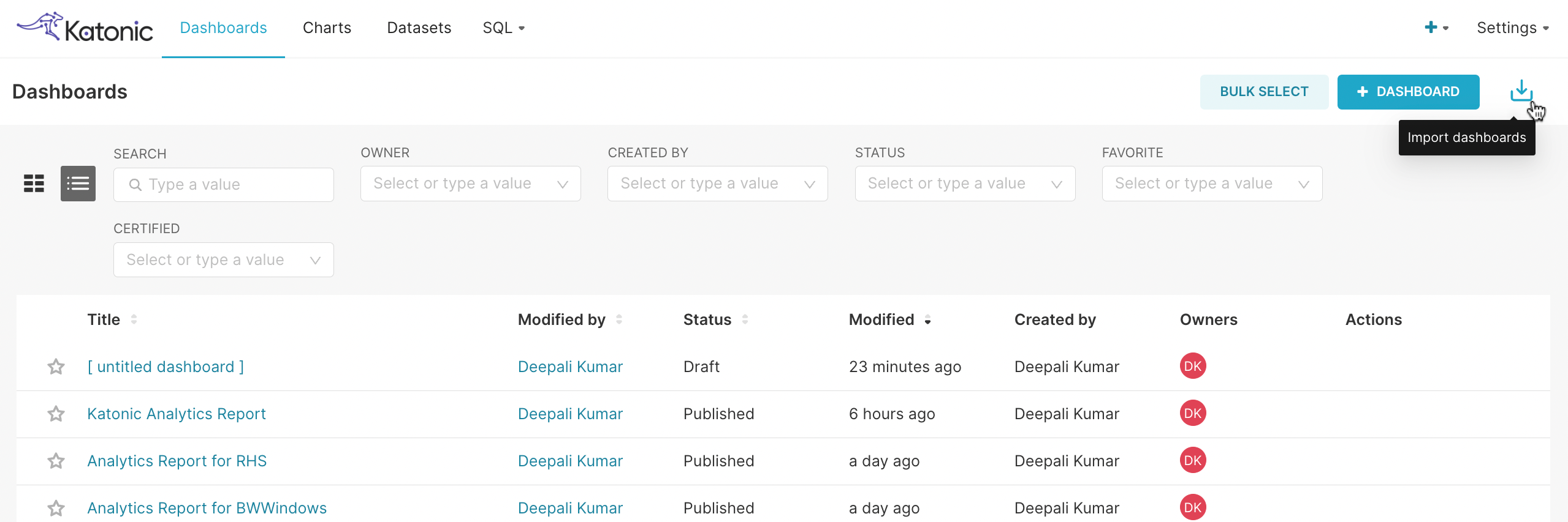
Dashboards: It will show all the dashboards.
Charts: It will show all the charts.
You can connect the database by clicking on "+".
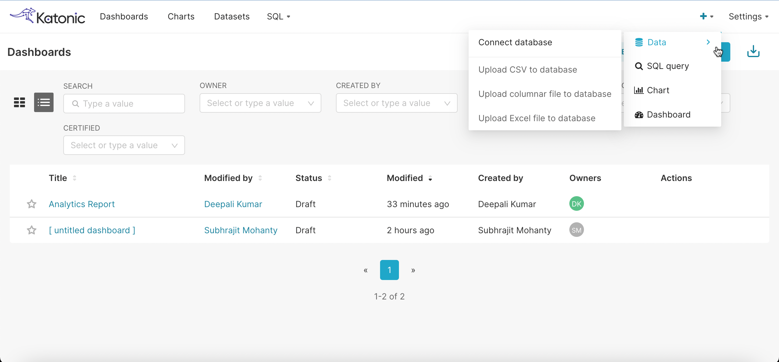
- By clicking on this, you have an option to Create dataset.
- You can select the dataset you want to connect.
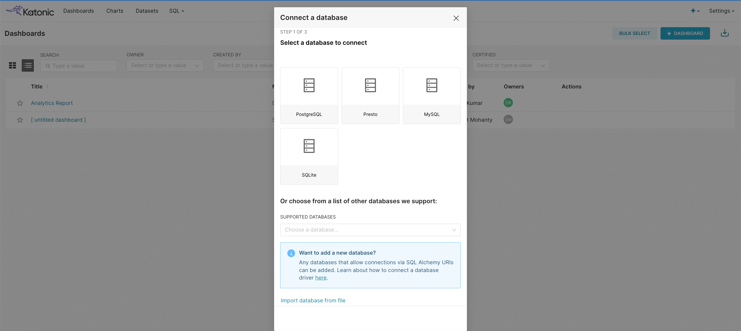
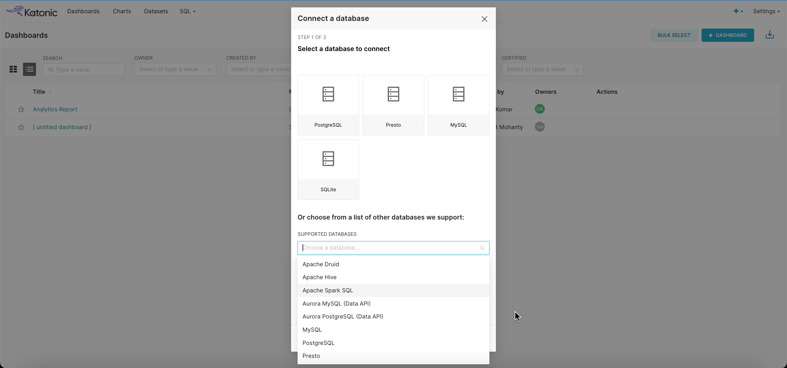
- You can also choose the databases from the given list.
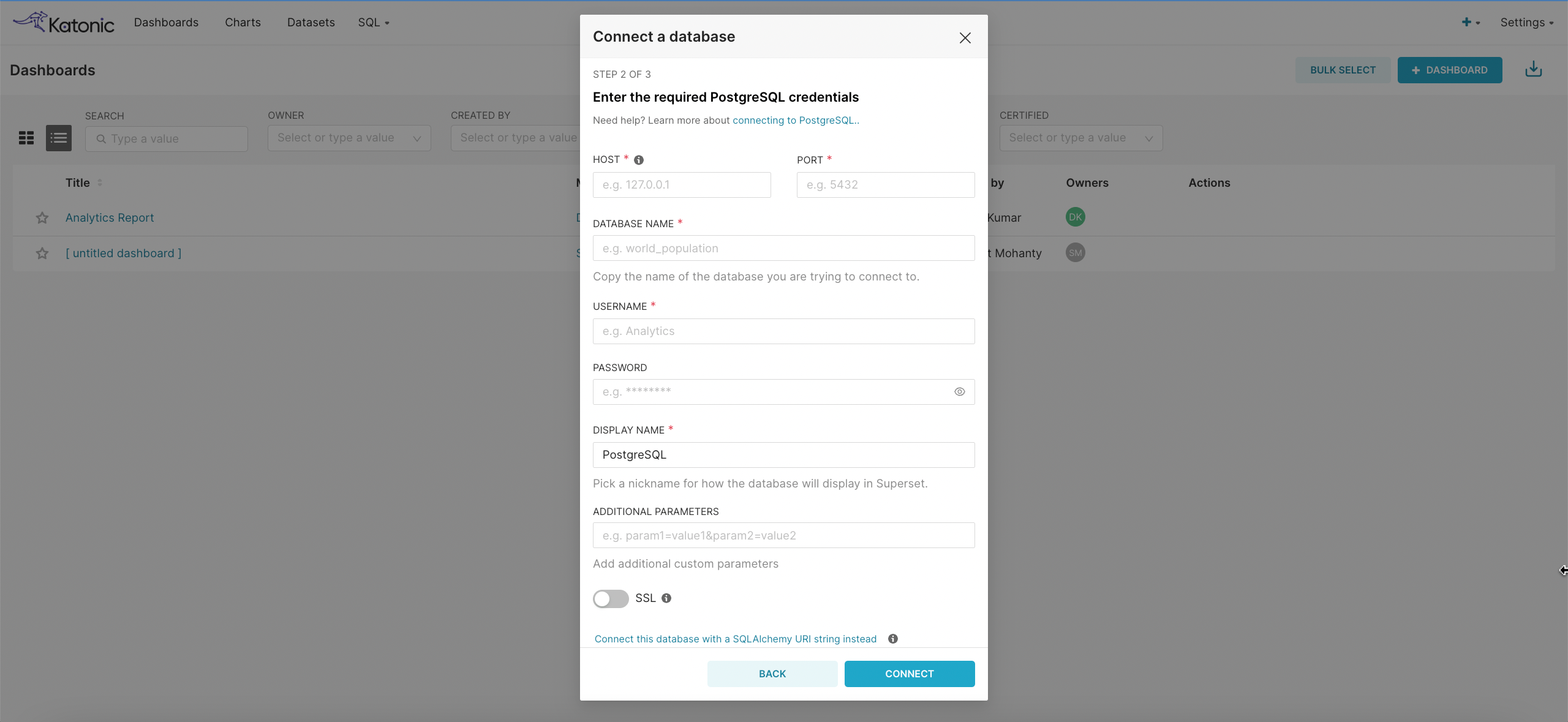
- After selecting the database you want to connect, please add the required details like,
- Host
- Port
- Database Name
- Username
- Password
- You can select the dataset you want to connect.
- By clicking on this, you have an option to Create dataset.
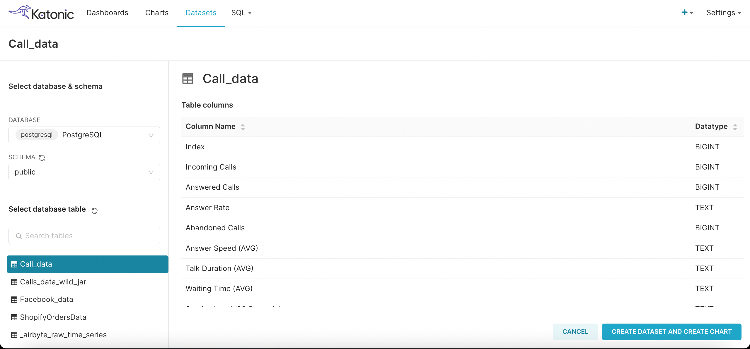
After connecting to the database, you can create dataset by clicking on + Dataset.
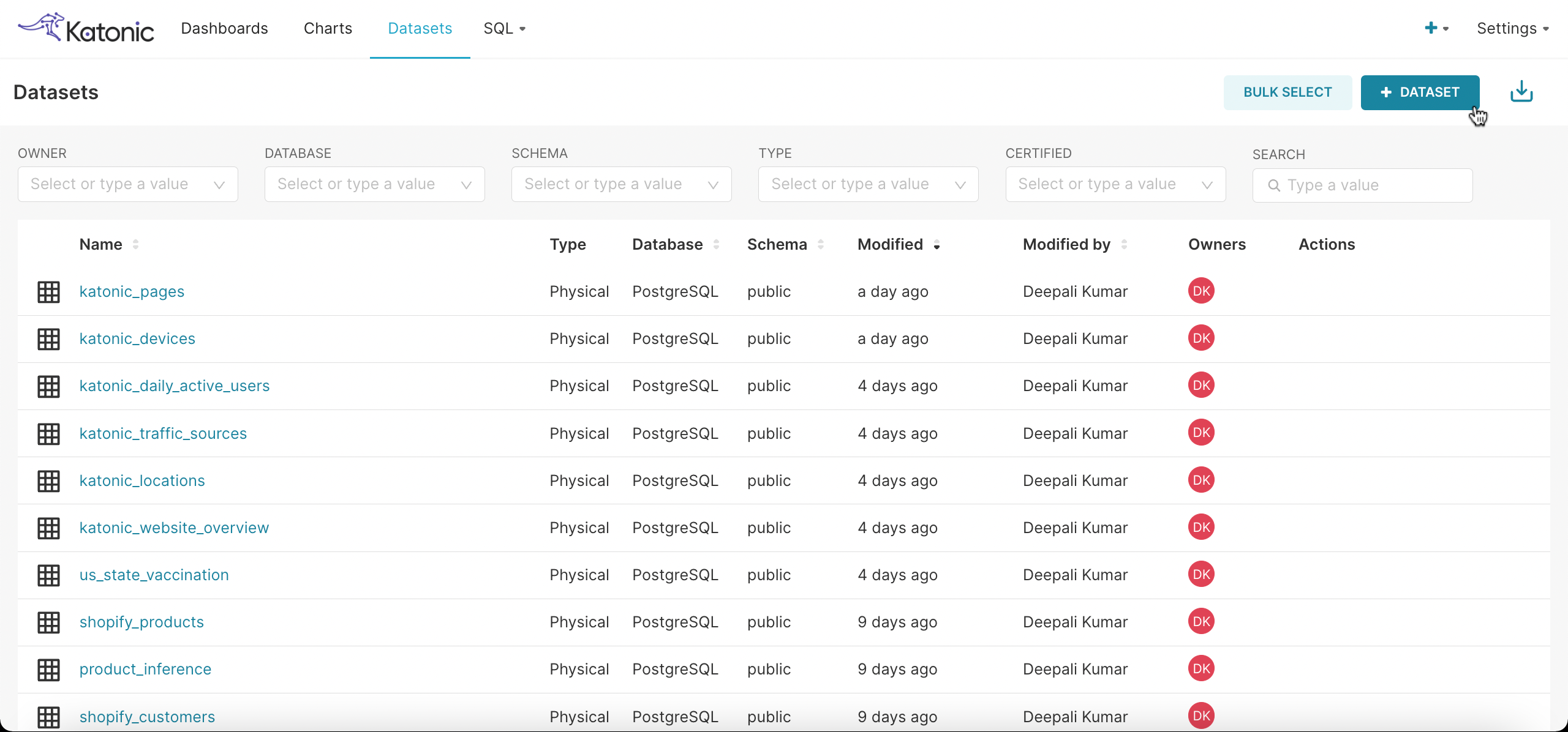
- In dataset, you have to choose the type of the DATABASE, then select the SCHEMA, your dataset will appear on the screen then click on Create Dataset and Create Charts.
- In dataset, you have to choose the type of the DATABASE, then select the SCHEMA, your dataset will appear on the screen then click on Create Dataset and Create Charts.
After selecting the dataset you want, you can choose a chart based on your requirements.
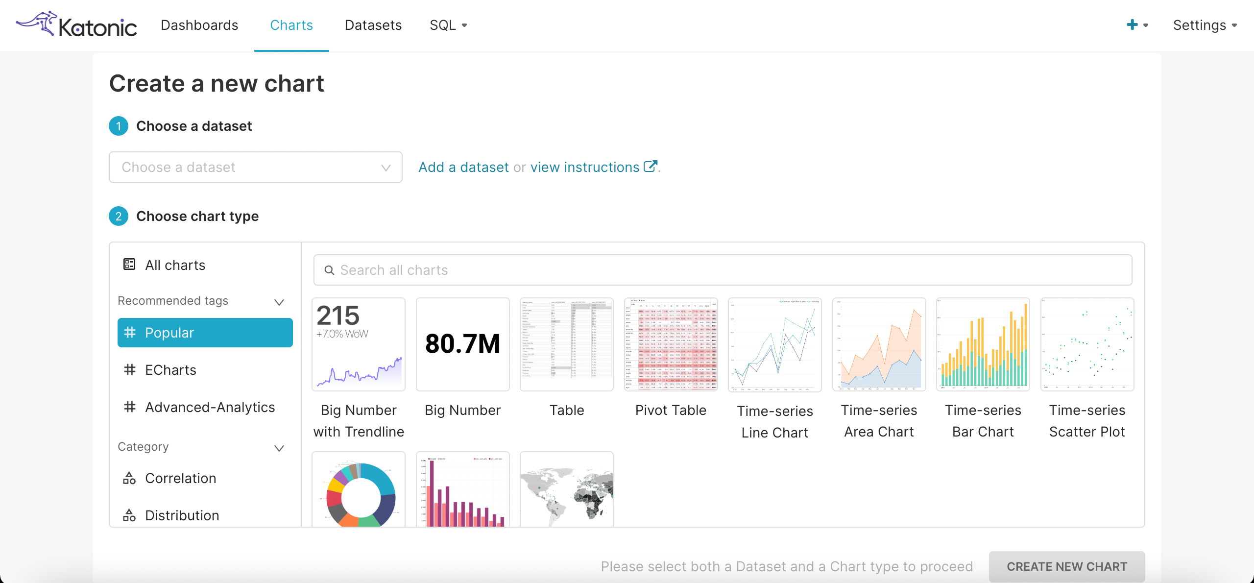
You can add the metric, dimensions and filters as you want and can also do customize the chart on the basis of colors scheme and presentation.
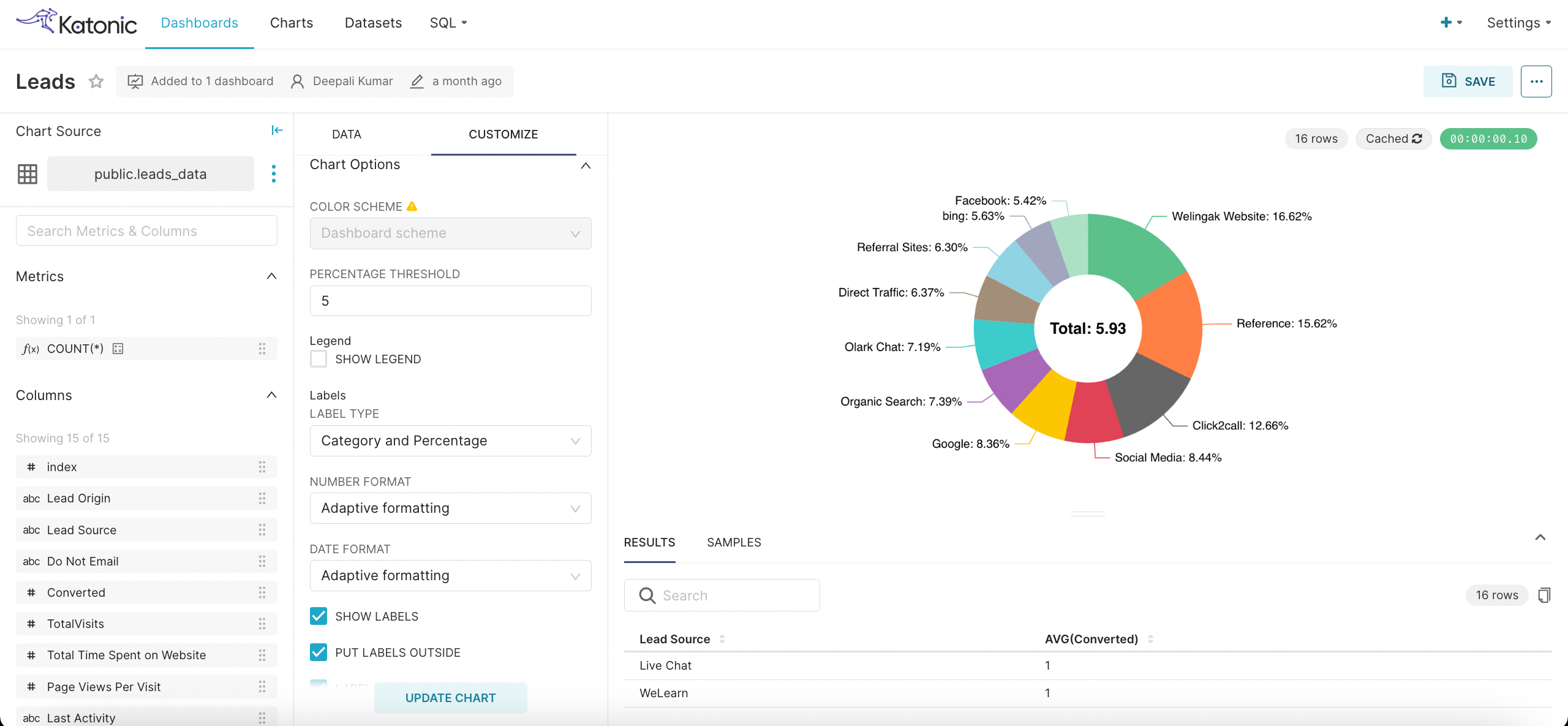
Give a relevant name to the chart and Save it.
Navigate to Dashboard section and click on + Dashboard.
You can create a new chart from here.
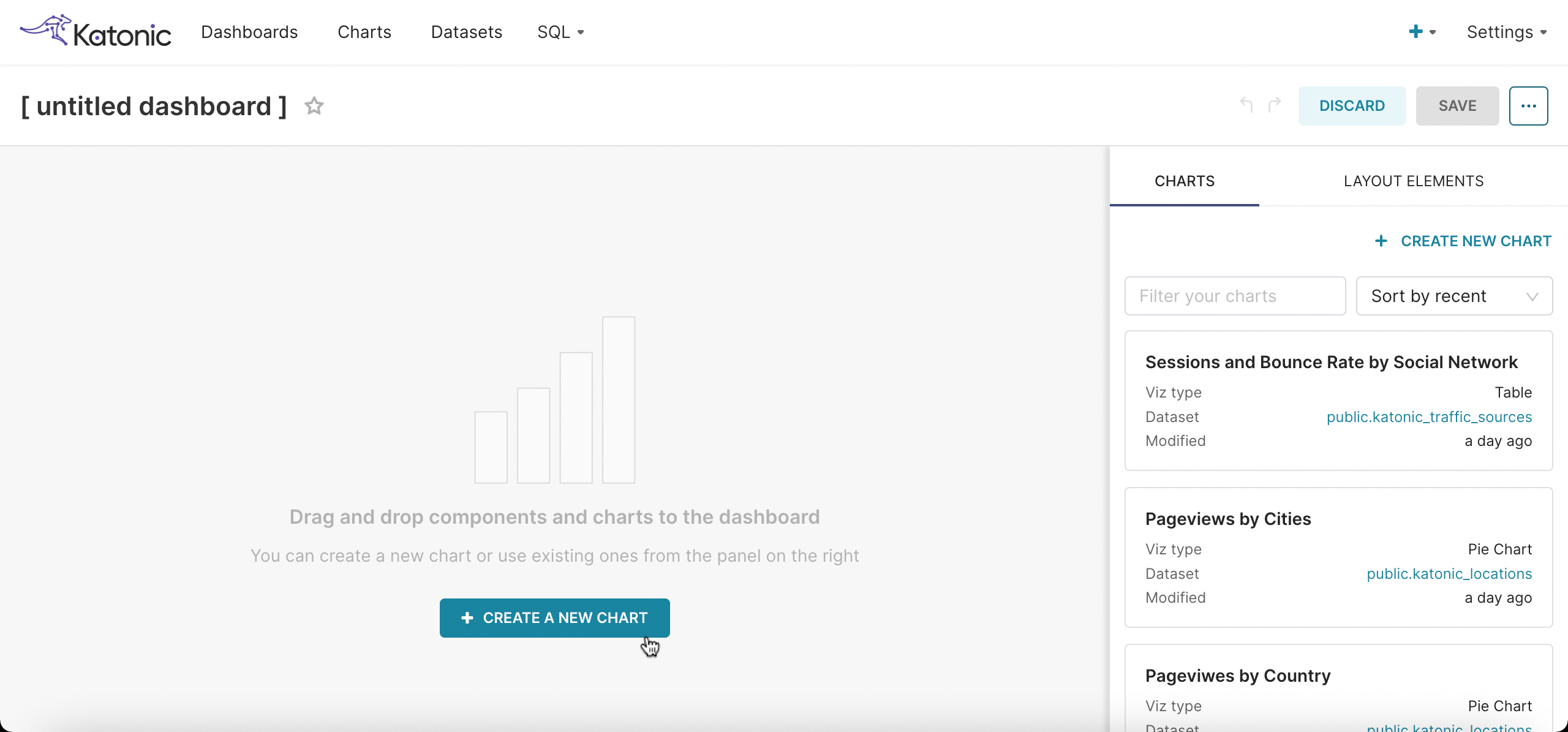
You can also just drag and drop the already created chart from the right panel.
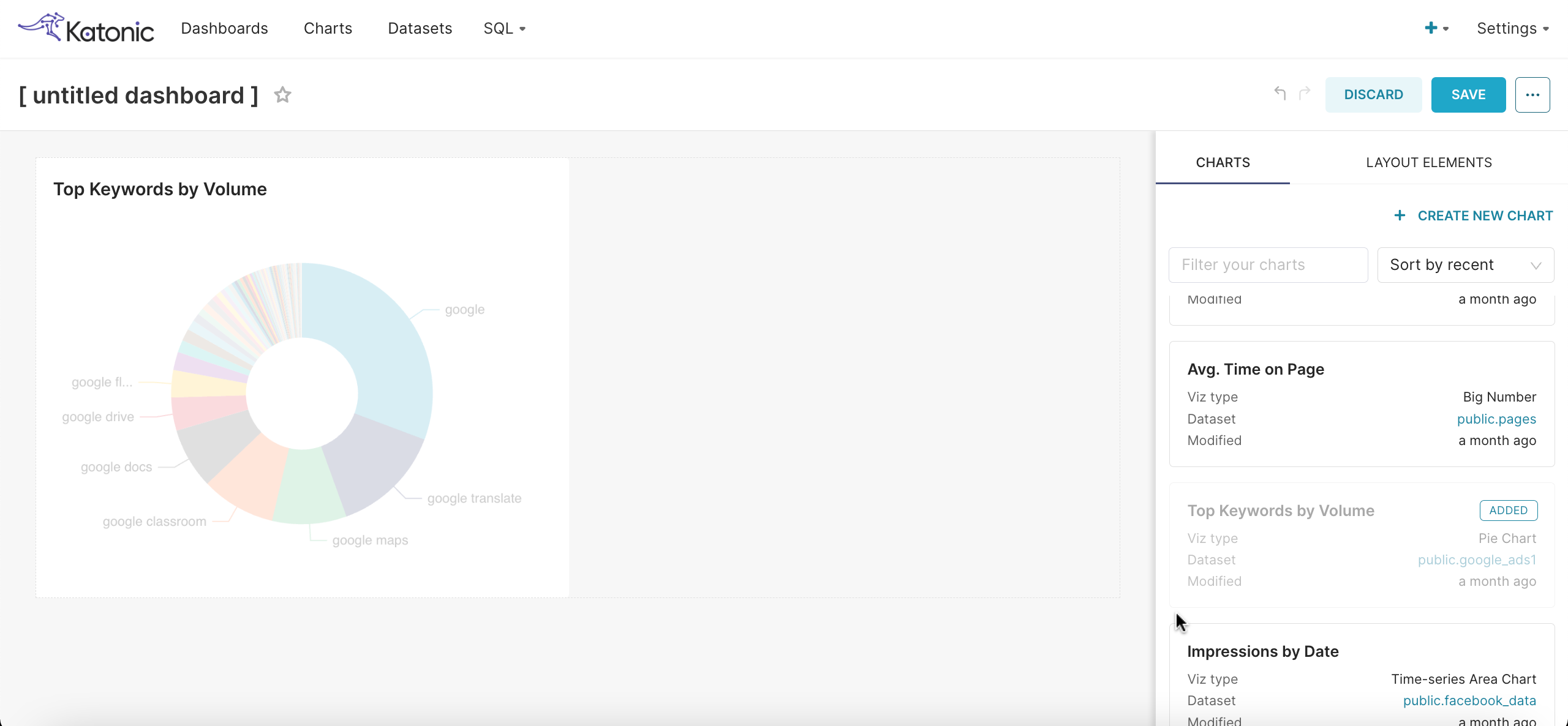
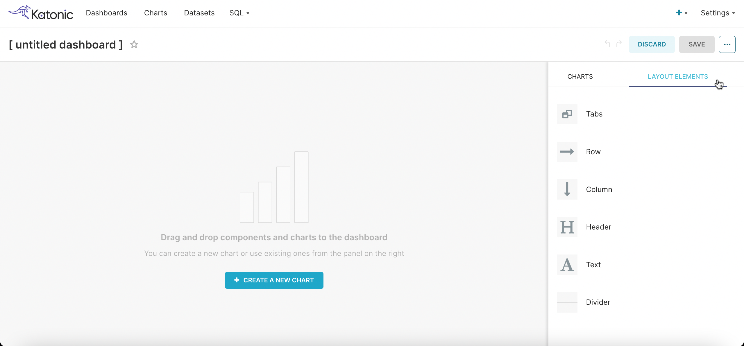
You can adjust the positioning of your charts and add some markdown in the dashboard by using Layout Elements.
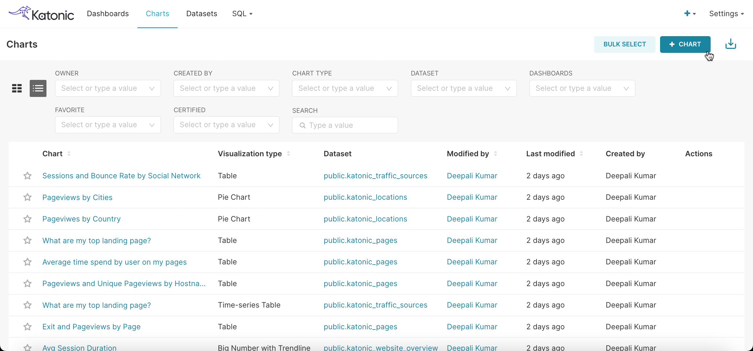
Navigate to the Charts section, here you can see all the charts created by you and can also create a new chart by clicking on + Chart.
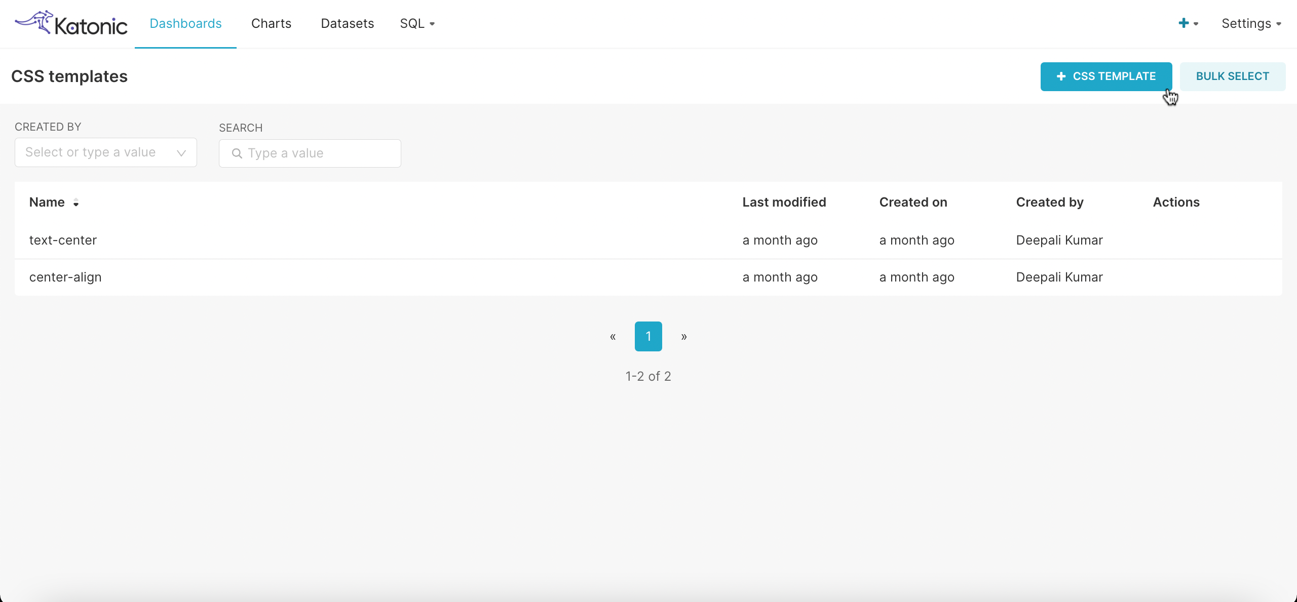
To make some changes in the format of the charts or images in the dashboard, you can add CSS Template.
Click on + CSS TEMPLATE.
Adding the name and the CSS details.
- For Example: I want to make an image as center align in the chart.
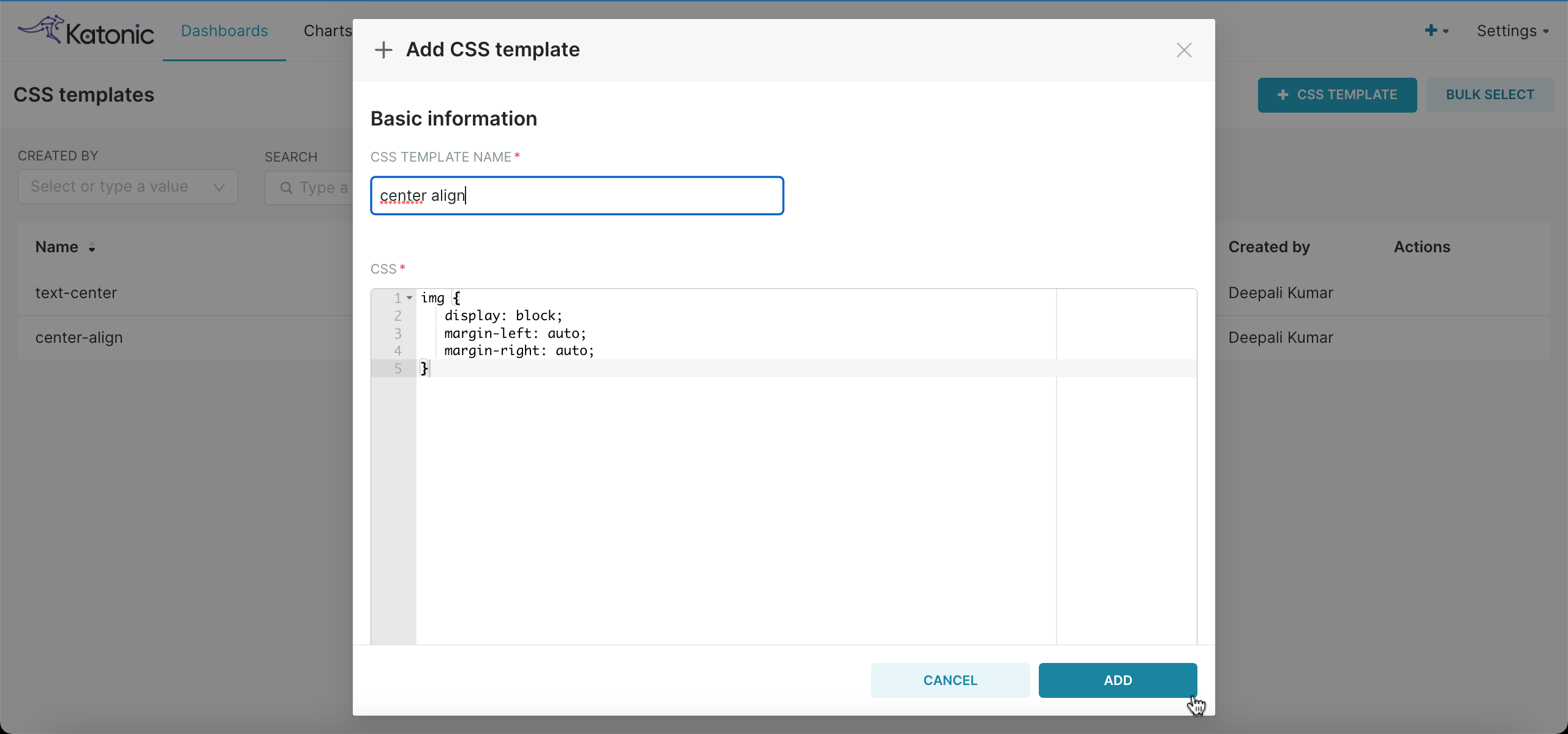
- For Example: I want to make an image as center align in the chart.
Click on Add and use this template in any of the dashboard you want by going to the particular dashboard.
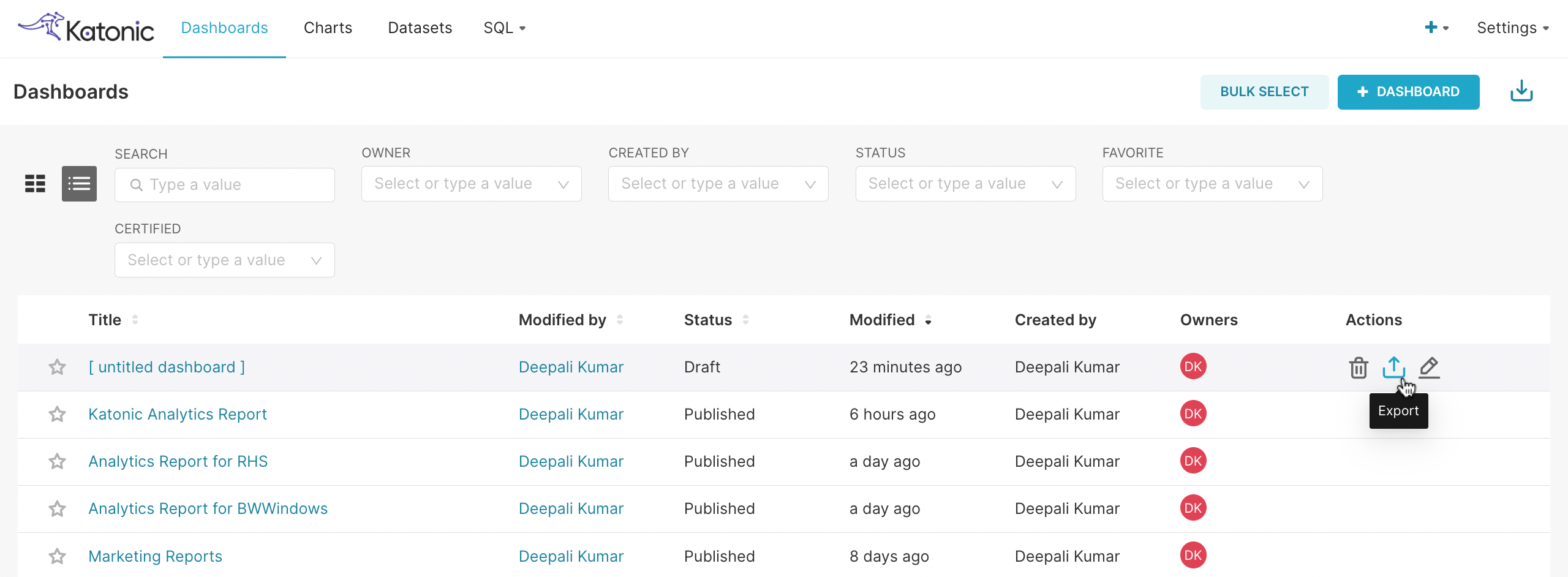
You can Import and Export the dashboard and charts.
- To export the dashboard, navigate to Dashboard, in Actions click on Export.
- To import the dashboard, navigate to Dashboards and click on Import Dashboard.
- To export the dashboard, navigate to Dashboard, in Actions click on Export.
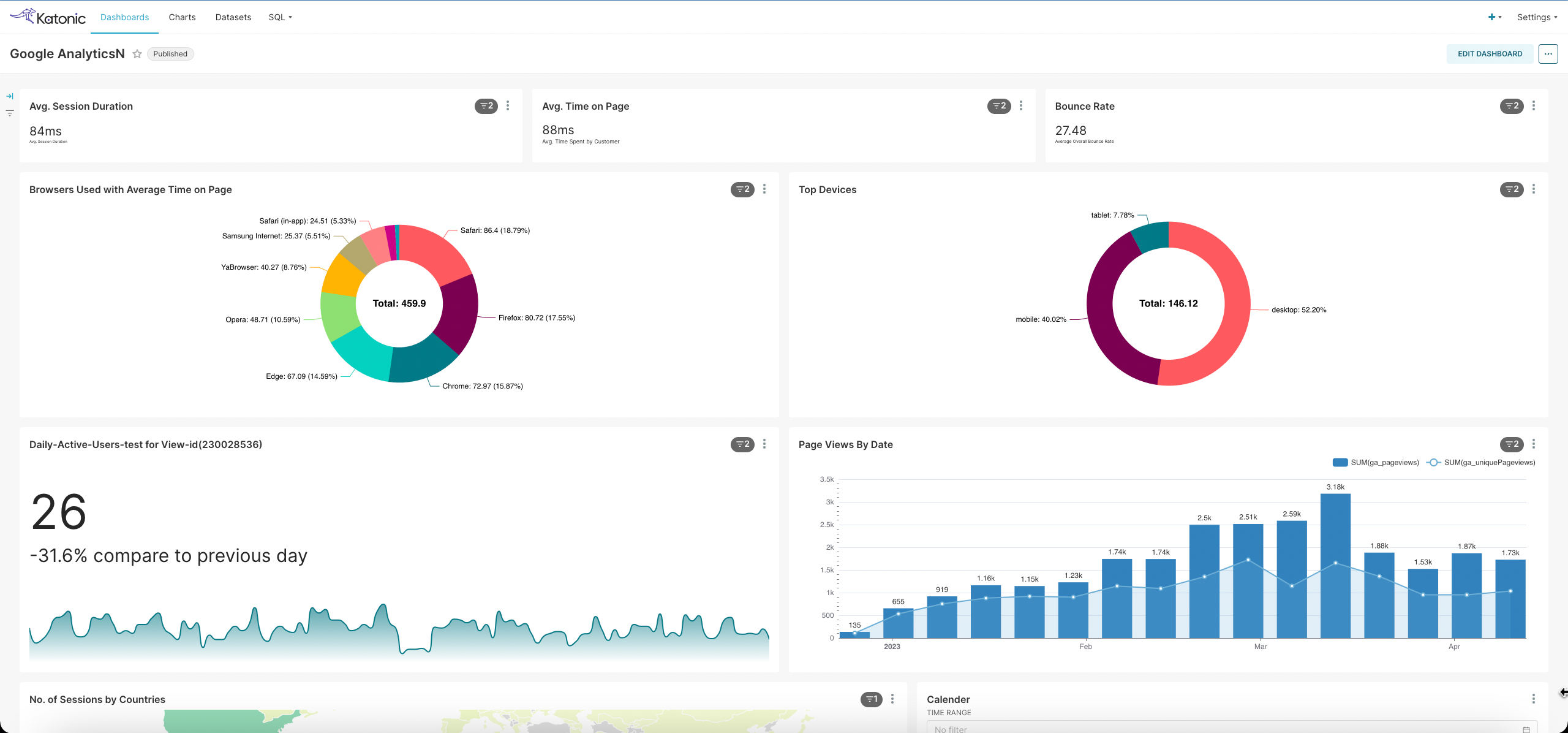
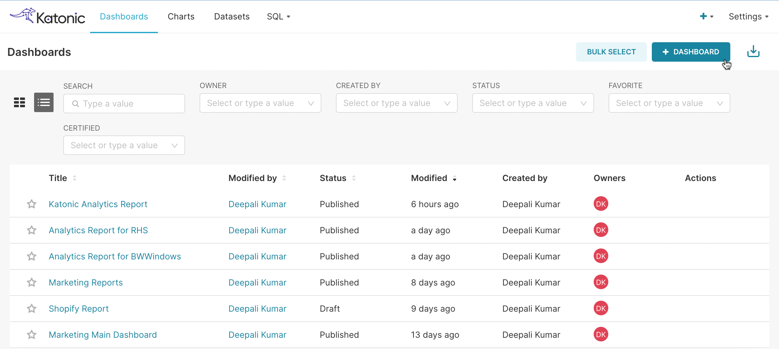
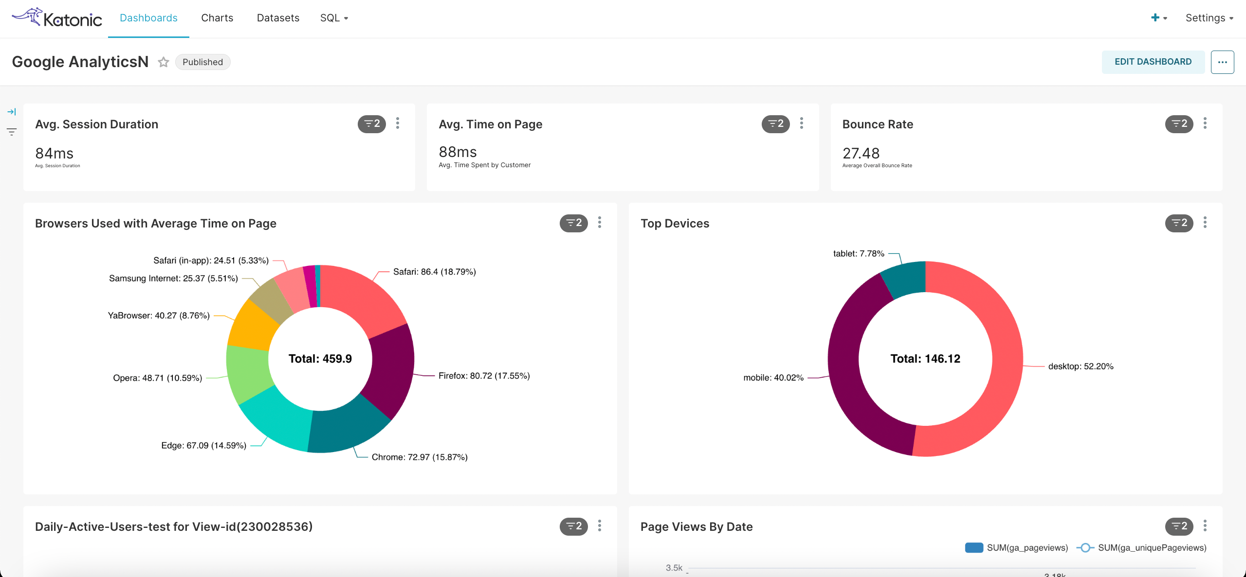
You can see your created dashboard in the Dashboards section.
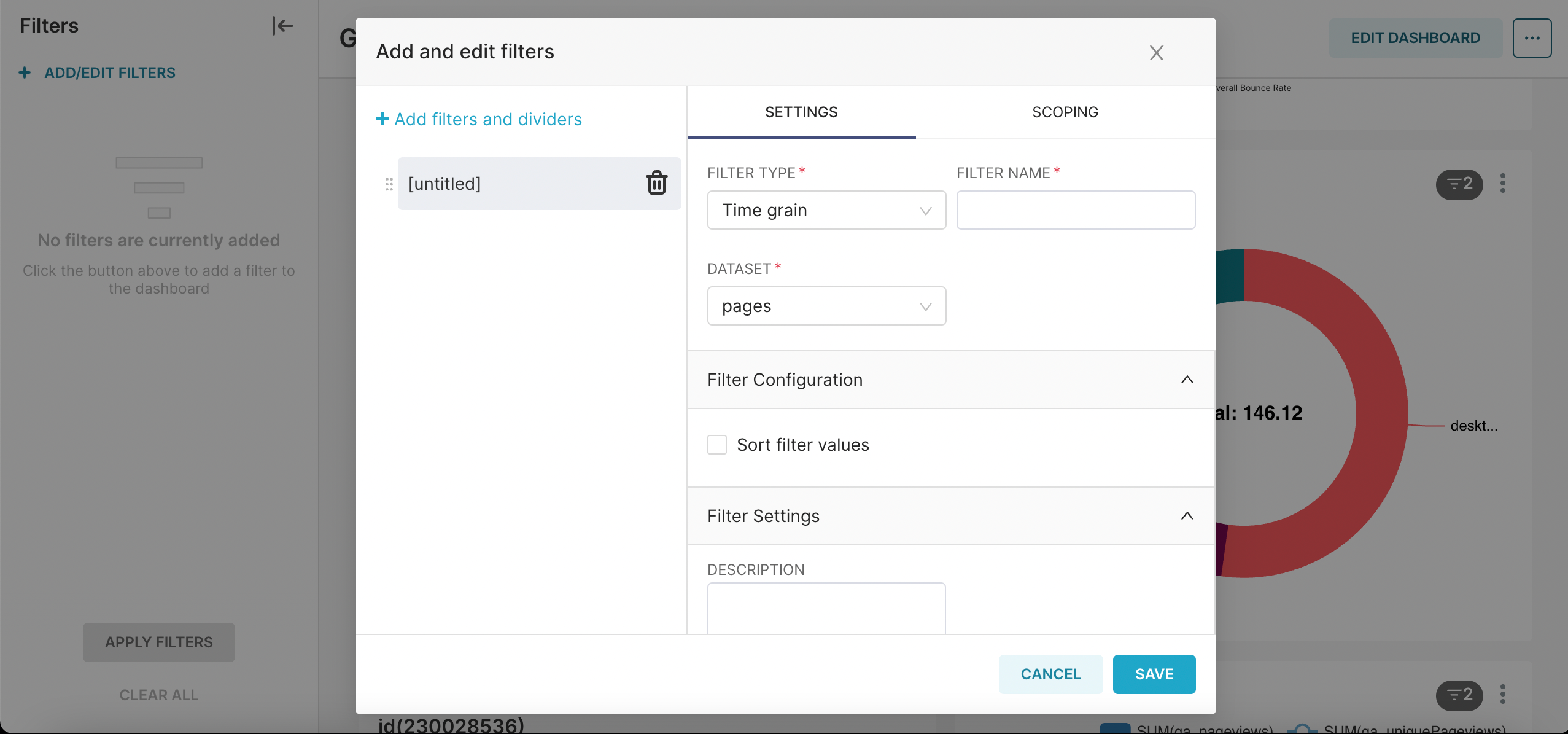
To add a date filter or any other filter you can click on Filters and then Add/Edit Filters.
- You can have options to add the filter requirements and on which panel you want to apply that filter. Save the filter.
- You can have options to add the filter requirements and on which panel you want to apply that filter. Save the filter.
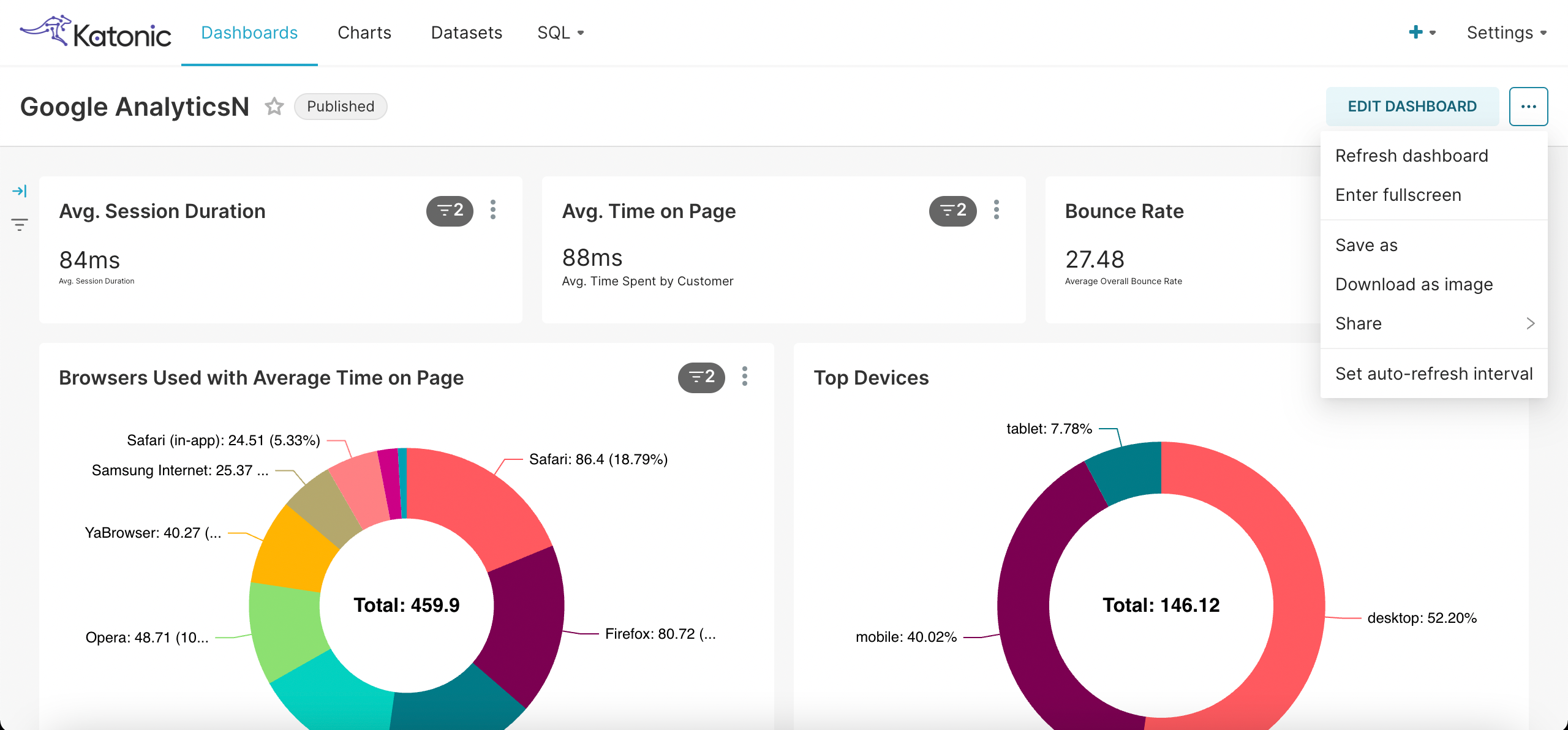
You can also have more options by clicking on three dots on the upper right of the screen such as,
- Refresh Dashboard: It refreshes the data and updated the charts in the dashboard.
- Enter Fullscreen: You can see the dashboard in the full screen.
- Save as: You can save your dashboard as a copy.
- Download as image: You can download your dashboard as an image.
- Share: You have an option to share your dashboard via link or by an email.
- Set auto-refresh interval: You can set an interval to refresh your dashboard for the given period of time. The dashboard will refresh automatically after that selected interval.
Hurrah! You have created a dashboard successfully. Now you can take your important business decision based on this.